CYNTHIA WOODS MITCHELL CENTER FOR THE ARTS
Using print collateral to communicate hierarchy and organizational structure, while building awareness about the brand
Cynthia Woods Mitchell Center for the Arts needed printed collateral designed that would help brand the organization and build awareness about the many programs it supports. It was also clear that the brand needed to educate the public about its connection to the University of Houston and its five member institutions as well as its unique autonomy as an endowed multi-disciplinary arts organization.
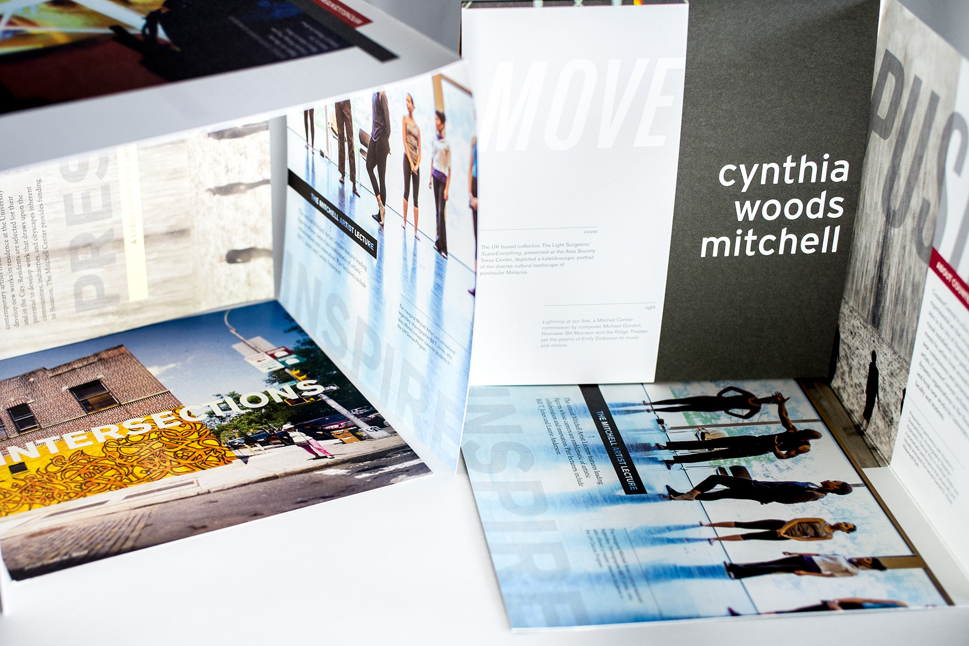
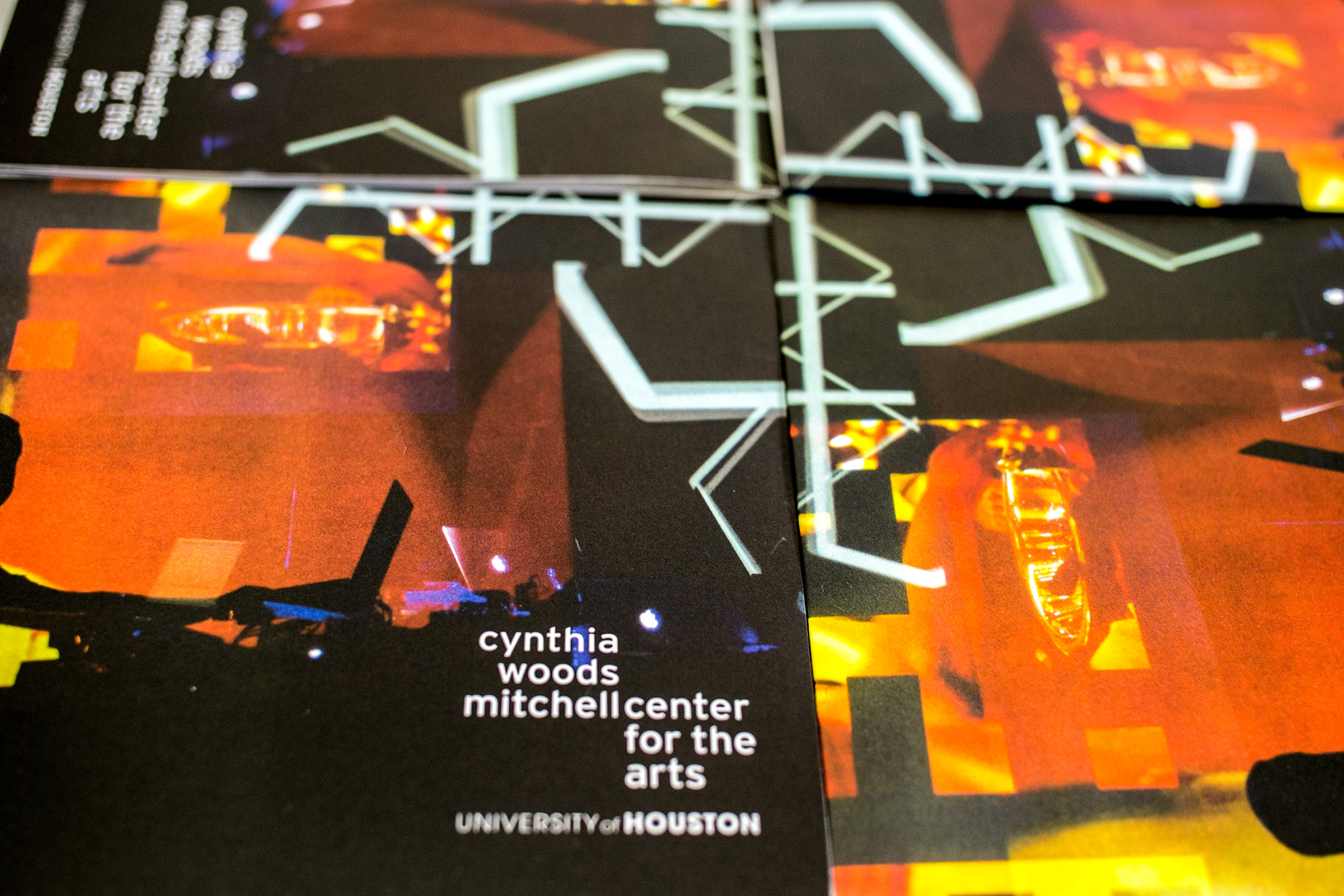
A name change or abbreviation was not an option for an organization that was named after a great patron of the arts, Cynthia Woods Mitchell. Based on the unique goals of the organization and certain design restrictions and limitations, we decided to use an evergreen brochure and use it as an opportunity to “own” the logo and name by making it the centerpiece of the printed collateral. As a non-profit, the organization was sensitive to budget and, therefore, resistant to any special printing techniques or larger format pieces. This eight-panel folded piece was designed to show the name in all its glory and powerful imagery captures the momentum and action associated with the Center’s dynamic performance and participatory programming. Each panel was used to educate audiences about the core components that compose the Mitchell Center. Inside, promotional inserts (designed as needed for special initiatives) allow the Center to curate content for each audience, while at the same time preventing the piece from becoming outdated.
TACTICS
Print Collateral Design
Positioning
MORE TO EXPLORE


