Most marketers understand the importance of a call to action. But let’s start from the beginning. What is a call to action? A call-to-action (CTA) is exactly what it suggests. It is an “ask”. You are asking the audience to take an action. Such as “Make a Donation”, “Start Clothing Drive”, “Purchase a Ticket”. In website design, CTAs are a way of taking a user through the experience of your website sometimes known as a conversion funnel. Crafting an effective call-to-action to an art all its own and there are more things to consider than just the color of your button. Here are some considerations that could help boost your conversions.
Context of the Call to Action
Consider the context in which the user is experiencing the call to action. For example, if they are reading about how to become a volunteer, it probably doesn’t make sense to ask them to “donate”. Instead consider what that user might be interested in. Such as “Sign up for our volunteer newsletter” or “Volunteer”.
Number of Asks
Depending on what kind of organization you are and what your end goal is, it can be good to have a series of smaller calls to action such as “view our season calendar” and then “get tickets” or in times of a capital campaign, the ask might simply be “DONATE!” Either way, too many CTAs are probably the 2nd biggest mistake you can make here beyond not having one at all. You don’t want to confuse or overwhelm.
Viewing Device
Considering the device your audience uses could/should influence the kinds of things you are asking them to do. For example, it isn’t realistic to think that someone who primary uses their phone to access your website is the audience you would ask to take a survey, unless it was a one or two question survey.
Button Design
Design of your call to action buttons and banners are definitely important. I personally like playing with color and shape. Juxtaposing the general shapes and colors to bring more attention to your call to action can help catch the user’s eye.
Time & Place
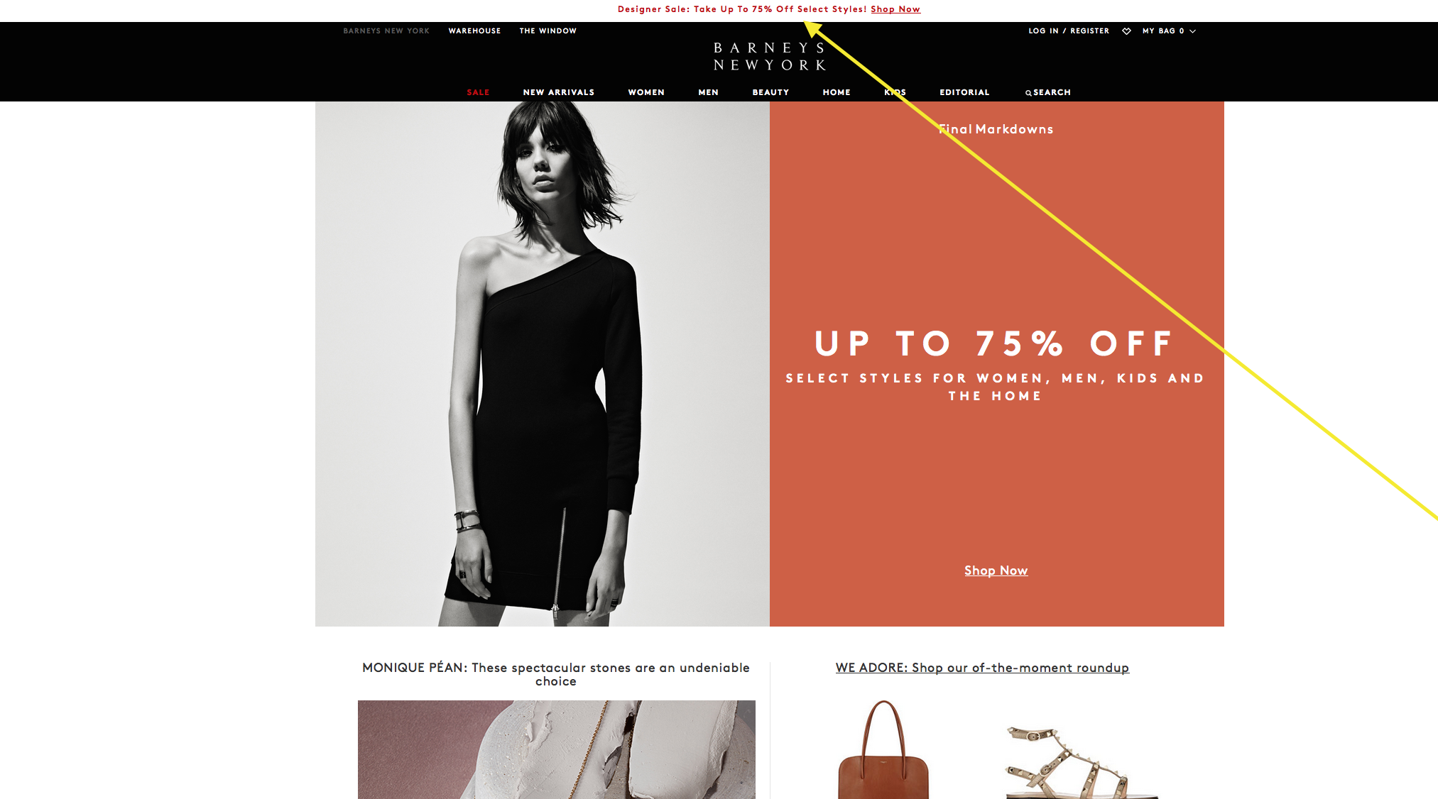
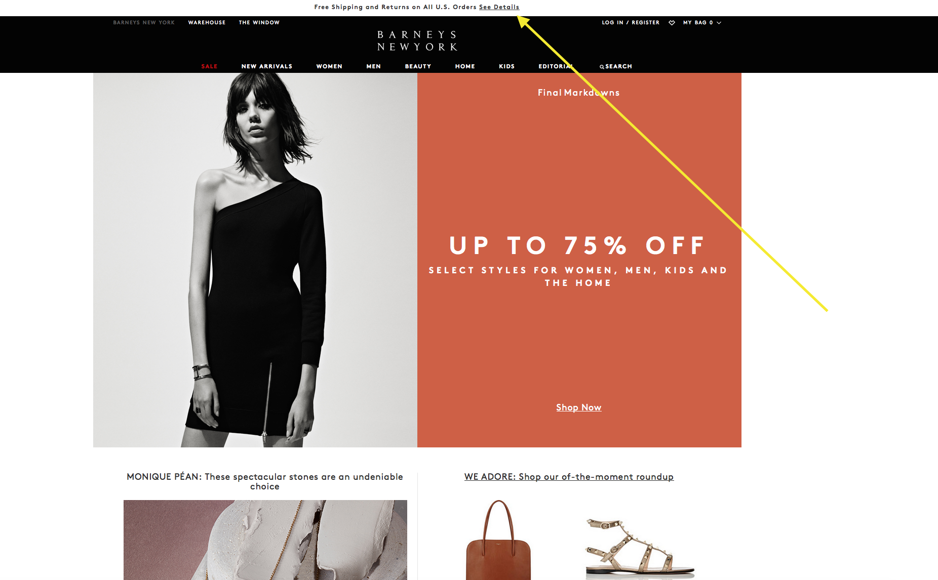
As they say a lot in business (and in life)…. it’s all about timing. When we think of popping a big question, let’s face it; time and place can influence your success rate. There are a few factors that might help here. First, if a visitor is a first time visitor to your website, you might not immediately insist they “signup for your newsletter” with a pop-up or screen takeover. Instead, you might do that later once they have read some of your content. The same goes for asking them to “become a member” etc., etc. On the same note, you don’t want that info to go totally away either. A call to action or special offer should be easily accessible for a user when they finally decide to take action. It may be a strange comparison, but I do have to say I have learned a lot by taking cues from one of my favorite fashion brands, Barneys! See how the offer is always at the top and it changes! Simple, but something nonprofits could easily put to practice too.
Back to all posts


